The Room Makes the Case: A Brand Audit for UK Client Meeting Spaces
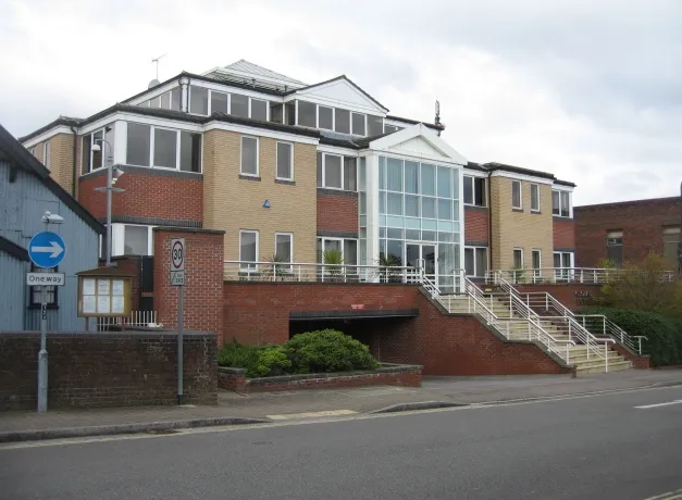
Photo: Sebastian Ballard, CC BY-SA 2.0, via Wikimedia Commons
When a UK service firm invites a client into its office, the visit begins before the first handshake. The reception desk, the meeting room and even the route to the washroom are already making an argument about the business. In a hybrid-working era, the office has become less a daily container for staff and more a venue for deliberate encounters: pitches, reviews, onboarding sessions and relationship-building visits. That shift gives physical space a sharper brand role. It is no longer enough for a room to be tidy and available. It should provide evidence for the promises the firm makes in its proposals, its website and its conversations.
MJ Design Studio approaches this as a design problem rather than a facilities task. The aim is not a full fit-out or a costly refurbishment. It is alignment: a series of small, observable changes that help a client believe what the firm says about itself. The method below is deliberately modest. It assumes limited budgets, busy teams and buildings that must keep working while improvements are made.
The room as a claim
Every client-facing space makes claims. A calm, well-lit meeting room suggests composure. A cluttered reception suggests distraction. Mismatched signage suggests a business that has grown without pausing to edit. None of these signals is decisive on its own, but together they form a background argument that either supports or undermines the spoken pitch.
The first task is therefore to compare claims with conditions. If the brand promise is precision, does the room look precise? If the promise is warmth, does the welcome feel warm rather than merely procedural? If the promise is sector expertise, is there any visible evidence of that expertise beyond a framed certificate in a corridor? The audit should be honest. A room does not need to be luxurious, but it should be coherent.
A room-by-room audit
Threshold and reception
Begin outside the building. Can a visitor identify the entrance without instructions? Is the nameplate clean, legible and correctly fixed? At reception, check the first three signals: the surface in front of the visitor, the sightline beyond the desk and the material quality of the signage. A scratched acrylic sign or a curling paper notice will be noticed, even if only unconsciously.
Low-cost improvements include replacing temporary notices with a single printed or mounted welcome panel, editing out outdated awards and event posters, and ensuring the first view from the seating area is composed rather than accidental. If the reception doubles as a storage zone, screen it. If the lighting is harsh overhead, add a floor lamp with a warm bulb. These are small moves, but they change the register of the space.
The meeting room
The meeting room carries the most concentrated brand load. Check the table surface, chair condition, cable management, screen placement and the wall behind the main speaker. A scuffed table and a tangle of cables suggest that preparation is optional. A clean table and a tested screen suggest that the meeting has been considered.
Signage inside the room should be minimal. A small, well-made room name or floor marker is enough. Materials matter more than decoration: a natural timber table, a wool chair fabric or a simple linen curtain can do more for perceived quality than a wall of generic graphics. Lighting should be adjustable. Acoustics should allow normal conversation without strain; a rug, a curtain or a felt panel can reduce echo at modest cost. Printed leave-behinds should be current, neatly stored and relevant to the visit. A single well-designed summary sheet is better than a thick pack that no one reads.
The refreshment moment
Tea and coffee are not a brand afterthought. The vessel, the tray, the sight of the kitchen and the timing of the offer all contribute to the visitor's impression. Chipped mugs and a cluttered counter undo a great deal of careful presentation elsewhere. A simple refreshment protocol is enough: matching crockery, a clear tray, a small jug of water and a biscuit or fruit option that suits the time of day.
This is not about hospitality theatre. It is about evidence of care. If the brand promise involves attentiveness, the refreshment moment is one of the clearest places to demonstrate it. The same applies to the washroom and the route back to reception. A visitor who encounters a loose tap, a flickering light or a stack of boxes will file that away as part of the overall judgement.
A low-cost refresh method
Start with observation rather than purchase. Walk the client route as if seeing it for the first time. Note what is broken, what is outdated, what is inconsistent and what is simply unnecessary. Photograph each point. Then divide the findings into three groups: fix now, fix within the quarter and fix only if the room is redecorated.
The next step is editing. Many meeting rooms do not need more brand expression; they need less visual noise. Remove obsolete posters, mismatched furniture and duplicate notices. Replace temporary signage with one clear system. Where possible, reuse existing frames and mounting points. A modest budget is often best spent on lighting, a rug, cable management and a small quantity of well-printed collateral rather than on wall graphics that will date quickly.
Finally, rehearse the room. Sit where the client will sit. Check the sightlines, the screen, the acoustics and the leave-behind. Ask a colleague who has not been involved in the project to describe what the room says about the firm. Their answer will reveal whether the alignment is working.
A practical checklist
- Entrance and reception signage is clean, legible and current.
- The first sightline from reception is composed, not accidental.
- Temporary notices have been replaced or removed.
- Meeting room table, chairs and cables are in good order.
- Screen and presentation equipment have been tested.
- Lighting is adjustable and avoids harsh glare.
- Acoustics allow comfortable conversation without echo.
- Materials and finishes are consistent with the brand's quality claim.
- Printed leave-behinds are current, relevant and neatly stored.
- Refreshment equipment and crockery are clean and matched.
- The route to the washroom is clear and well maintained.
- A colleague has reviewed the room from the client's perspective.
Evidence before expenditure
The client meeting room is not a stage set. It is a working environment that should make the firm's character visible without strain. For UK service businesses in 2026, when office visits are fewer and more intentional, the physical room has become a useful piece of brand evidence. The work is rarely dramatic. It is the patient removal of contradictions between what the firm says and what the visitor sees. Handled with care, that alignment supports the pitch before the meeting has properly begun.