The Shopfront Test: Building UK Place Brands from the Pavement Up
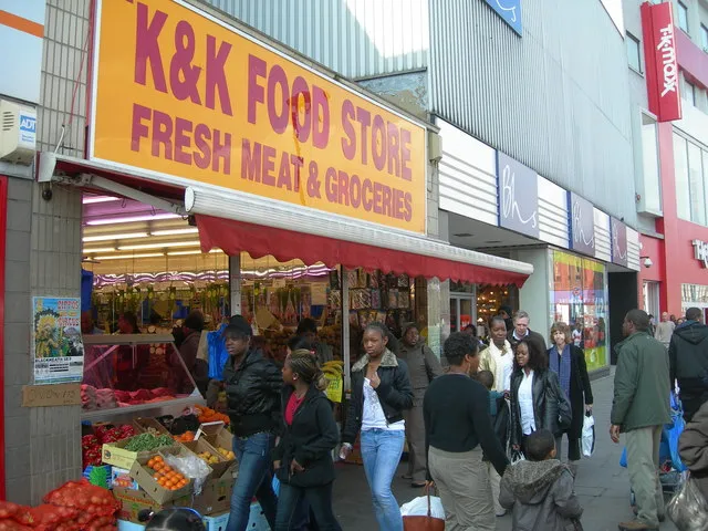
Photo: Danny Robinson, CC BY-SA 2.0, via Wikimedia Commons
Place branding has a credibility problem in many UK towns, and it is not caused by a lack of ambition. It is caused by the distance between the strategy document and the shop floor. A council or business improvement district commissions a place brand, receives a logo, a tagline and a set of banners, and installs them on lamp posts. Meanwhile, the independent retailers who give the high street its character are making their own design decisions—often with skill, sometimes with tape and a laminator—and those decisions are rarely part of the conversation. The result is a place brand that describes a town rather than one that is recognisable in it.
Why the deck is the wrong starting point
Place brands often begin with stakeholder workshops, demographic data and a vision statement. These are useful, but they are abstractions. A high street is experienced through small details: the legibility of a hanging sign, the colour of a shopfront, the welcome on a chalkboard, the route between the car park and the market square. If a place brand does not account for those details, it will struggle to feel true.
The independent shop is the most honest design research available to a place brand team. It shows what actually works at walking pace, in British weather, with a limited budget and a real need to attract custom. That is a more useful starting point than a mood board of international cities.
What independents teach place brands
Signage that works at walking pace
Independent shop signage is a masterclass in constraint. A useful fascia must be legible from across the street, readable at an angle, and compliant with local planning rules. Hand-painted lettering, cut vinyl, engraved brass and powder-coated steel all communicate something about the business before a customer enters. The best examples use one strong idea rather than five competing ones. In towns such as Hebden Bridge, Ludlow or Stockport's Underbanks, the most memorable signs are often the ones that respect the building rather than shout over it.
Windows as editorial space
The shop window is the high street's homepage. Independents change displays for seasons, stock deliveries and local events. A good window uses props, lighting and negative space to tell a story. Place branding can learn from this discipline: a town's visual identity should be flexible enough to change with the calendar, not a fixed template applied to every empty unit. A window scheme that allows for a Christmas display, a summer produce theme and a quiet January edit will be adopted more readily than a rigid graphic that only works in a presentation.
Wayfinding at human scale
Many town centre wayfinding schemes fail because they are designed for the back of a brochure rather than the pavement. Independents use A-boards, chalkboards, window decals and simple directional signs. These are not always beautiful, but they are responsive. A place brand that offers a family of sign types—rather than a single monolith—will be easier to adopt. It will also age better, because it can be added to as the town changes.
Materials that age well
Retail design is honest about materials. Timber, brick, brass, terrazzo and powder-coated steel weather in different ways. A place palette drawn from local materials will feel more grounded than a palette borrowed from a trend report. This is not about nostalgia; it is about visual evidence. If a town's brand colours are derived from the stone of its civic buildings and the painted wood of its shopfronts, they will look plausible on a sign, a leaflet and a website.
From shopfloor to strategy
None of this means that place branding should be reduced to a photographic survey of shopfronts. Strategy still matters. But the strategy should be tested against the shop floor. A useful process is to walk the high street at three times of day, photograph every sign, window and wayfinding element, and ask which decisions are working. Then translate those findings into principles rather than rules: typographic tone, colour, image style, sign hierarchy and a tone of voice that sounds like the place rather than a consultation document.
The role of the place brand is to connect, not to standardise. It should give a traders' association, a council and a business improvement district a shared visual language without erasing the individuality that makes a high street worth visiting.
Practical takeaways for market towns and city quarters
- Start with a design audit of the high street, not a workshop. Record signs, windows, materials and wayfinding before writing a brief.
- Fund shopfront improvements alongside brand assets. A new logo is less useful if the fascia it sits on is crumbling.
- Produce a pattern book rather than a rulebook: principles, examples and approved materials that can be adapted by individual businesses.
- Commission a local photographer to build an image library that reflects the actual street, its seasons and its people.
- Create a trader toolkit with template signs, window graphics and social assets that small businesses can afford to use.
- Pilot wayfinding at human scale, with a family of sign types rather than one expensive monument.
- Avoid over-branding empty units; a place brand should support occupancy, not decorate vacancy.
- Measure success through dwell time, footfall and trader uptake, not just impressions of a launch campaign.
The test of a place brand
Ultimately, a place brand should pass a simple test: can a visitor recognise the town from its details before they read its name? If the answer is yes, the brand is doing its job. If the answer is no, no amount of lamp-post banners will compensate. The high street is the evidence. Design from it.