Credibility in Print and PDF: Designing UK Bid Submissions That Evaluators Believe
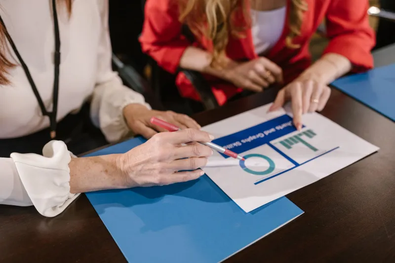
A tender response is not a brochure. It is a reading experience with consequences. Evaluators may have dozens of submissions, a fixed scoring framework and limited time. They are not looking for decoration. They are looking for evidence that the firm understands the requirement, can deliver it and will not create avoidable risk.
For smaller UK firms, this is an opportunity. A well-designed bid document can close a perceived credibility gap before anyone meets the team. A poorly designed one can undermine strong experience. The difference is rarely a matter of expensive production. It is a matter of discipline.
A tender is a reading experience before it is a sales document
Many bid documents fail at the first hurdle because they are organised around the supplier's history rather than the evaluator's questions. The reader should not have to hunt for the answer to a scored criterion. The structure should follow the tender's own logic, with clear cross-references and a contents page that reflects the scoring headings.
A practical structure is straightforward: an executive summary that states the offer and the outcome; a section demonstrating understanding of the requirement; the proposed method and approach; evidence from comparable work; the team and governance; risk management; social value where required; and a separate pricing response. Each section should begin with the answer, not a warm-up paragraph.
Structure: make the evaluator's job easy
Evaluators often score against specific questions. If the response buries the answer in page eight, the score will suffer. Use the tender's wording in headings where appropriate, and keep the order consistent with the invitation to tender. Where a portal limits uploads or page counts, design for that constraint rather than against it.
A capability statement should be shorter and more modular than a full tender. It might include a concise positioning statement, sector experience, selected case studies, team biographies and contact details. It should be easy to update and easy to read on a laptop. The same discipline applies to pitch PDFs: a clear narrative, a visible structure and a modest amount of well-chosen evidence will outperform a dense deck of generic credentials.
Typography and layout: quiet discipline beats decoration
Bid documents are read quickly. Body text should generally sit at 10 to 11 point, with generous line spacing and a line length that does not tire the eye. A sans-serif typeface is often the safer choice for screen reading, though a well-set serif can work for print. Headings should create a clear hierarchy, not compete with the content.
Colour should be used sparingly. A single accent colour can guide the reader through headings, tables and callout boxes. Large blocks of dark background with light text may look striking on a screen but become tiring across many pages. Tables need clear headers, consistent alignment and enough white space to remain legible when printed in black and white.
Accessible document design is a commercial advantage
Accessibility is not a niche concern. Public sector buyers increasingly expect documents to meet accessible publishing standards, and private clients benefit from the same clarity. Use real heading styles rather than manually formatted text. Add alt text to meaningful images. Check colour contrast. Avoid scanned pages presented as evidence. Provide bookmarks in longer PDFs and use tables for data, not for layout.
A tagged PDF is more likely to be read correctly by assistive technology, and it also tends to be better organised for everyone else. Plain English matters as much as technical compliance. Short sentences, defined acronyms and consistent terminology reduce the risk of misinterpretation. In a tender, ambiguity is a cost.
Evidence-led case studies: show the work, not the adjectives
A case study in a bid should do more than say that a project was successful. It should state the situation, the intervention and the outcome. Where possible, include a measurable result: time saved, enquiries handled, compliance improved, staff retained or cost reduced. If the outcome cannot be quantified, describe the change in concrete terms and explain the client's context.
Smaller firms often have strong, directly relevant experience but present it poorly. A case study should make the relevance obvious. Name the sector, the scale and the constraints. Explain what the team actually did. Include a client quotation only where it adds specific credibility. Avoid generic claims such as 'passionate about quality' unless the document immediately shows what that meant in practice.
Visual signals that help a smaller UK firm
Evaluators make judgements before they read every word. A clean cover, a logical contents page, consistent margins and a readable type scale signal that the firm is organised. Those signals matter when the buyer is assessing delivery risk. They suggest that the team can manage complexity, communicate with stakeholders and produce work that will not embarrass the client.
A smaller firm does not need to imitate a large consultancy. It needs to look in control. That means consistent branding, careful proofreading, sensible file naming and a document that opens without errors. It also means resisting the urge to include every project. Three well-evidenced case studies are usually stronger than ten thin ones.
The final check
Before submission, read the document as an evaluator would: on screen, under time pressure and against the scoring criteria. Check that every required question has a visible answer. Confirm that the PDF is accessible, searchable and within any page limit. Ask someone outside the bid team to find three key pieces of evidence. If they cannot, the structure needs work.
At MJ Design Studio, we treat tender design as an exercise in clarity rather than ornament. The goal is not to make a bid look expensive. It is to make it easy to trust. For a smaller UK firm with strong work and limited time, that is a commercial advantage worth designing for.