The Parish Pump Principle: Designing Community Magazine Ads That Earn Trust

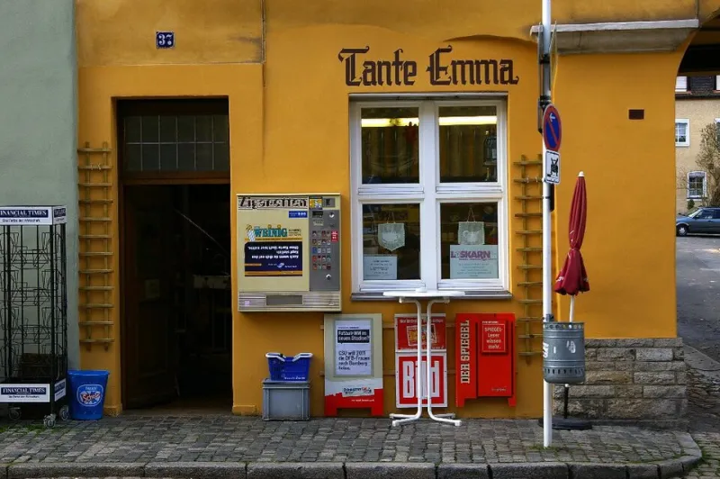
Photo: MirkoS18, CC BY 4.0, via Wikimedia Commons
A quarter page in a village magazine in the Cotswolds, a residents' association newsletter in suburban Manchester, a diocesan title that lands on three thousand kitchen tables: these are modest pieces of media with an unusual property. They are read by people who are not in a hurry.
For UK service businesses — heating engineers, dental practices, funeral directors, independent opticians, accountants — that environment rewards a particular approach. Clarity beats cleverness. Consistency beats novelty. A recognisable advert that turns up month after month quietly outperforms a spectacular one-off that nobody can place by the following issue.
What follows is the method we use when adapting a brand system to small-format local advertising.
Why the format behaves differently
Four things separate community print from almost every other channel. Readers are residents rather than an audience, so relevance is geographic and immediate. The publication is kept, often for the full month, and frequently revisited. Advertising density is low, which means an advert is not competing with thirty others on the same spread. And trust transfers by association: appearing alongside the cricket club fixture list and the parish notices lends a legitimacy that display advertising has to buy.
None of that helps if the design is unreadable.
Ten rules for local print that works
1. Buy the right size, not the biggest. A well-designed quarter page outperforms a crammed half page almost every time. Match the size to the offer: a single service in a single area rarely needs more than a quarter page.
2. Design for the kitchen table, not the studio monitor. Assume the reader is holding the magazine at around 300mm, possibly with reading glasses. Body copy no smaller than 9pt, high contrast, no reversed-out type below 11pt, and no light weights on coloured stock.
3. One advert, one job. A single headline in plain English — 'Boiler servicing across Harrogate and Knaresborough' — does more than a slogan. If the business offers six services, run six adverts across six months rather than one crowded page.
4. Make the offer legible and dated. 'Twenty per cent off your first service before 31 March' is an offer. 'Great value all year round' is a mood. Readers respond to specificity because it signals a business that has thought about them.
5. Local proof beats clever copy. Years trading, accreditations, a named engineer, the street the workshop is on, a review count, membership of a trade body. These are the details that make a local reader decide the firm is real. Regulator marks should be reproduced properly, at a size where the logo is still identifiable.
6. Keep the brand furniture identical. Logo lock-up in the same corner, same palette, same typeface pairing, same tone. The recognition is the asset. A reader who has seen the advert eight times will call before they have read a word.
7. Give the call to action a route that survives print. A telephone number in large type. A QR code tested on two handsets and pointing at a page built for the campaign, not the homepage. A walk-in address if the premises matters. And a line of text — 'mention the parish magazine' — for the people who will never scan anything.
8. Leave the white space. Aim for at least a third of the advert to be empty. It is the single clearest signal of confidence in a crowded local market.
9. Build a template, not a one-off. One master file, three variants: service, seasonal and recruitment. A template means the eleventh insertion costs a fraction of the first and stays perfectly on brand.
10. Book a run. Three consecutive issues teach a readership who you are. A single insertion teaches them that you once existed.
What credibility looks like on the page
Consider two heating adverts on the same spread. The first is a full-bleed photograph of a boiler, a starburst, six services and three phone numbers. The second is a quarter page: a line drawing of a radiator, the firm's name, 'Gas Safe registered engineers covering Didsbury and Withington since 1998', one telephone number, and a small photograph of two named engineers outside a van.
The second reads as a business with a postcode and a reputation. The first reads as an advert. In a community title, that distinction is worth more than the difference in page size.
The pre-press checklist
- Copy proofread by a second person, with postcodes and telephone numbers checked digit by digit.
- Three millimetres of bleed and crop marks supplied, artwork in CMYK at 300dpi.
- Fonts outlined or embedded, and the master file archived with the live version.
- QR code scanned and tested, with a fallback URL printed beneath it.
- Accreditations reproduced at a legible size, with current membership numbers.
- Publication deadline, artwork deadline and insertion dates logged in the studio's schedule, not in someone's inbox.
- A single tracking method agreed before publication, so the first month's response can be attributed.
The compounding effect
The appeal of community magazines is not a single insertion. It is the accumulation: the same colours, the same name, the same promise, arriving eleven times a year in a publication the reader already trusts. Plan for a year, design for the kitchen table, and resist the urge to be interesting at the expense of being clear. In local print, being unmistakable is the whole strategy.