What Clients Mean When They Say 'Premium': Building a Shared Vocabulary for Design Reviews
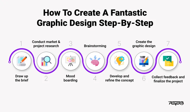
Photo: design studio client review meeting sticky notes on wall, via reverbico.com
Every studio in the country has sat through the same meeting. A homepage concept is on screen, the room goes quiet, and the client says: 'It is lovely. It just does not feel premium.' Heads nod. The next forty minutes disappear into a discussion about a shade of grey, and everyone leaves slightly less certain than when they arrived.
The difficulty is not that the client is wrong. It is that the word they have chosen is a verdict rather than an instruction. Premium, friendly, modern, warm, trustworthy, clean, bold — these are the closing lines of an argument the client has already had with themselves. Our work is to reopen that argument and find the evidence inside it.
A verdict is not a brief
Adjectives of this kind describe an effect rather than a cause. When a client says a page does not feel premium, they are usually reacting to something specific and namable: cramped margins, four typefaces competing on one screen, stock photography that appears on three competitor sites, or a headline set so large it reads as a shout. The perception is accurate. The vocabulary is simply missing.
Treating the word as a brief wastes everyone's time. Treating it as a symptom gives the project something to work with.
Build the vocabulary before the review, not during it
Language work belongs at the start of an engagement, when nobody is defending a design they have already seen. We run a short sorting exercise in the discovery session and keep the results on file for the rest of the project.
Sixteen cards, one word on each, spread across the table. The client sorts them into three piles: words that describe us, words that describe our competitors, and words we would actively reject. The rejections matter as much as the selections — a client who winces at 'boutique' has told you more about their positioning than one who ticks 'professional'.
From there, we ask for one example per kept word. A website they admire, a hotel they stayed in, a piece of packaging they kept. Concrete references convert opinion into specification far faster than abstract discussion ever will.
A working glossary
What follows is the table we take into reviews. It is deliberately plain, and it is edited for every client, but the structure holds.
| Client word | What it usually means in practice | Design decisions that serve it |
|---|---|---|
| Premium | Restraint and space; a sense that nothing was added to fill a gap | Generous margins, one typeface family in three weights, long-form or commissioned photography, a palette of two neutrals plus an accent, fewer claims per screen |
| Friendly | Approachability without loss of competence | Rounded terminals, warmer neutrals, photography with real people and eye contact, plain-English copy in the second person, softer corners |
| Modern | Current, uncluttered, technically assured | Contemporary grid, confident scale, system sans-serif, restrained motion, but a short shelf life — revisit every three years |
| Trustworthy | Predictability and evidence | Strict alignment, consistent logo lock-up, credentials high and legible, body text no smaller than 16px, visible contact details |
| Warm | Human rather than corporate | Off-white rather than pure white, texture in imagery, hand-set details used sparingly, sentence case over capitals |
Print this out. Put it on the wall during the review. It converts a debate about feeling into a conversation about craft.
The review session, restructured
Most reviews fail on structure, not on design. Ours runs to a fixed hour with a facilitator who owns the clock and a scribe who owns the record.
- Five minutes: restate the brief. Read the positioning sentence and the three objectives aloud. This is not padding; it resets the room.
- Ten minutes of silence. Each attendee looks at the work without speaking and writes observations on sticky notes. Silence removes the anchoring problem where the most senior voice speaks first.
- Twenty minutes of three questions. For each direction: What did you see? What did it suggest to you? What would you change, and what would that change achieve?
- Fifteen minutes of mapping. Match every comment to a word in the glossary and to a specific element on the screen.
- Ten minutes of decisions. What is agreed, what is parked, what needs a further round.
The three questions do most of the work. They move the room from verdict to observation, and observation is something a designer can respond to.
The worksheet that keeps everyone honest
One row per comment, four columns. What you said. What we heard. Where it lives in the design. Decision.
So the note 'doesn't feel premium' becomes: generous spacing in the header, a single accent colour instead of three, a commissioned photograph rather than library stock, and a commit-and-test decision for the next round. The client sees their own language returned with a plan attached. That single move does more for trust than any mood board.
Keeping the review out of the taste arena
A few habits hold the line.
Ask for evidence, not preference. 'Show me where' is a fairer question than 'do you like it'.
Score against criteria. If the brief promised clarity and the concept delivered it, say so before discussing anything decorative.
Record dissent rather than resolving it live. The person who disagrees on the day is often right three days later, once they have stopped being surprised.
Watch for the proxy voice. In committee-led organisations, the loudest attendee is frequently guessing at what an absent director will think. Name that openly and offer to test the work with the real decision-maker.
Return the lexicon with the next round. Language drifts between meetings; the document should not.
What changes when the words exist
Reviews shorten. Rounds reduce. Better still, the client keeps the glossary, and it turns up again in their internal conversations long after the studio has handed over. A brand is easier to defend when the people who own it can say precisely what they meant by premium — and point at the margin that proves it.