The Reasoned Shortlist: Presenting Three Logo Directions Without Paralysis
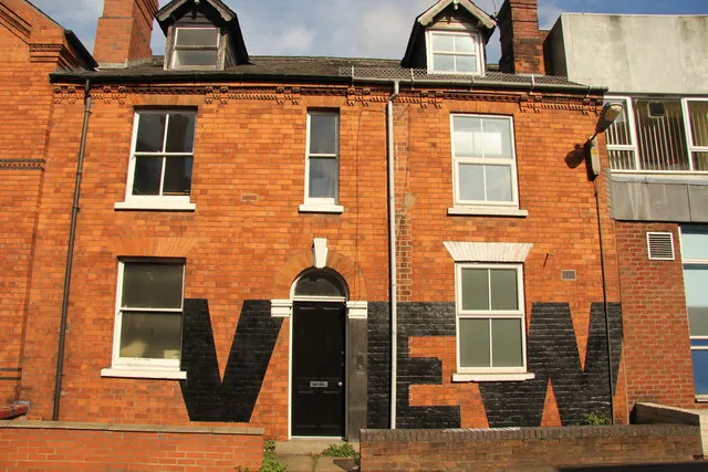
Photo: Richard Croft , CC BY-SA 2.0, via Wikimedia Commons
A logo presentation can fail even when the work is strong. The usual cause is not a weak mark but a weak decision structure. When a client is shown six or seven options, the conversation drifts towards personal preference: a favourite colour, a shape that reminds someone of a competitor, a letterform that feels friendlier on the day. The result is a choice made in the room rather than a choice made for the business.
A more disciplined approach is to present three routes. Not three variations of the same idea, and not a dozen sketches reduced to a shortlist, but three clearly differentiated directions. Each should be framed by strategic rationale, shown in realistic context, and assessed through a simple scoring method. The aim is not to remove judgement from the process. It is to give judgement something firmer to work with.
Why Three Routes Work
Three is a useful number because it creates contrast without creating noise. One route can sit close to the market norm, one can stretch the brand towards a clearer point of difference, and one can occupy a middle ground. The client can see the consequences of each position rather than being asked to react to a wall of possibilities.
Fewer than three routes can feel predetermined. More than three tends to encourage scanning rather than reading. For UK SMEs and service brands, where the owner or leadership team is often close to the decision, three routes also make it easier to bring colleagues into the conversation without turning the review into a committee exercise.
The routes should be distinct at the level of strategy, not merely style. A different typeface, a different colour or a different arrangement of the same symbol is not a route. A route represents a coherent answer to a business question: how should this organisation be understood, remembered and trusted?
Build Each Route Around a Strategic Rationale
Every route needs a short written rationale before it needs a visual flourish. This should be presented in plain English and should cover five points: the business objective the route serves, the audience it is designed to persuade, the competitive context it responds to, the promise it makes, and the trade-offs it accepts.
The final point matters. A route that signals heritage may need to work harder to appear innovative. A route that signals accessibility may need more support to feel premium. Naming those trade-offs in advance prevents the client from discovering them later as disappointments.
At MJ Design Studio, we prefer route names that describe intent rather than aesthetics. Labels such as The Established Authority, The Collaborative Specialist or The Forward-Looking Challenger are more useful than something like Option A, Option B and Option C. The name gives the client a way to discuss the strategic territory, not just the picture.
Put the Logo in the Real World
A logo judged only on a presentation board is being judged in artificial conditions. Before the client is asked for a view, each route should be shown in the places where it will actually live. For a UK service brand, that might include a high street sign, a van livery, a quotation document, a LinkedIn profile image, a trade counter display, an exhibition stand and a tender submission cover.
Include the least glamorous applications. A mark that works beautifully at large scale but collapses in a favicon or a single-colour invoice has not been fully tested. Show the routes in monochrome, at small size and against the materials the business genuinely uses. This is not about producing a polished mock-up for its own sake. It is about letting the client see the operational reality of each decision.
Real-world context also reduces the risk of taste-led reactions. A client may not feel strongly about a symbol in isolation, but they will understand immediately whether it looks credible on a site hoarding, a professional services proposal or a product label.
A Simple Scoring Method
Once the routes have been presented, a light scoring framework can help the client move from instinct to evidence. Ask them to score each route from one to five across five criteria:
- Strategic fit: how clearly the route expresses the agreed positioning.
- Distinctiveness: how well it separates the business from obvious competitors.
- Credibility: whether it feels believable for the sector and the promise.
- Versatility: how well it performs across digital, print, signage and merchandise.
- Longevity: whether it can remain useful as the business grows.
If certain criteria matter more, apply a simple weighting. A professional services firm may weight credibility more heavily; a consumer-facing challenger may weight distinctiveness. The scores should not be treated as a mathematical verdict. Their value lies in exposing where the routes differ and where the client's priorities actually sit. A tie is not a failure. It is useful information about what the business values most.
Ideally, two or three decision-makers score independently before discussing the results. This prevents the most senior voice in the room from setting the tone before anyone else has formed a view.
Presenting the Routes in the Room
Sequence matters. Open with the brief and the agreed criteria, not with the studio's favourite option. Present each route with equal time and equal conviction. Show the rationale, the applications and the trade-offs before inviting comment. Ask for silent review first, then structured discussion.
A clear studio recommendation is not a bias; it is part of professional service. After the routes have been presented and scored, the studio should state which direction it believes is strongest and why. The client still decides, but they decide with the benefit of a reasoned view rather than an open-ended invitation to pick a favourite.
Finally, record the decision. Note the chosen route, the reasons for it, and the reasons the other routes were not taken. That record becomes useful when the identity is rolled out, when new colleagues join, or when someone later asks why the brand looks the way it does.
A logo presentation is not simply a display of options. It is a decision designed for the client. Three routes, properly framed and fairly tested, give UK business owners the confidence to choose on grounds of strategy, use and longevity rather than taste alone.